Sunday, February 21, 2010

Picking Colors


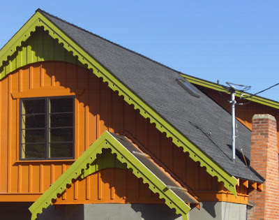
Deciding what color to paint a building can be one of the most difficult decisions in any restoration effort. First of all color is something that everyone has an opinion about (personally, I am not a fan of blue) and it is something that tends to disregard any professional training (I don't care how many graduate degrees you have, I just don't like blue). Couple that with the standard approach of painting a building based on a sample that is three inches square, people's general trouble of thinking spatially, and an always underlying fear of really making a mistake, and you have a situation almost guaranteed to induce white knuckles and closely cropped nails.

Is there a "right" color for a particular architectural style or building? Generally not, at least in my opinion. Are there clearly "wrong" colors for a particular architectural style or building? You bet. No matter how well a restoration is designed and constructed, paint it purple (or dayglo Orange) and you have failed. It's just a fact of life. But if somebody is reasonable, and of course most people are, it's pretty hard to really wreck a project with paint. I swear though, that is sure appears some people try. But even the worst decision is only a cover coat or two away from correction.

Some cities, and some review boards, get all twitchy about paint color, to the point where some historic commissions have been dubbed "the paint police" by detractors. That overly controlling approach is probably counter-productive. But there's always the bad apple that spoils the basket, and nobody wants to have their neighborhood graced with a Spite Purple house with Upchuck Orange trim either. There is a reason why most people paint within a fairly restrained palette. And it's a good reason, too. Buildings are BIG and a little color goes a long way.

I "get" to pick colors for commercial projects a lot, which is far less troublesome that picking colors for people's homes. Commercial projects, being what they are, tend toward the neutral and they probably should. I think if you have an interesting building, relying upon subtlety and shadow is both attractive, cost effective, and authentic. Nobody needs to have a "Hey Look At Me" sign that occupies a city block.
Wednesday, February 17, 2010

Chambers Covered Bridge


Sometime ago I became part of a team working on the process of reconstructing the Chambers Covered Bridge, located in Cottage Grove, Oregon. The Chambers Covered Bridge, unique among Oregon's remaining covered spans, was designed not to carry automobiles, but a logging railroad. Built in 1925 at the edge of the J. H. Chambers Mill, it served a small logging railroad that went out to the west and brought the huge trees, and the locomotive that pulled them, over the Coast Fork of the Willamette River, just south of downtown Cottage Grove.


As often happens, the mill burned (twice) and the rail line was scraped.  Eventually the land was sold for residential development but the old bridge remained, disconnected from its track, its purpose, but still too interesting (and large) to remove. After a complex legal process, it ended up in the ownership of the City, who have great plans to transform the bridge into a pedestrian and bike crossing, leading to the local high school and the Cottage Grove Campus of Lane Community College, located nearby. When the project started, the Chambers Covered Bridge was in pretty sorry shape, but the engineers thought it could stand until we got all the paperwork done.  Then we'd take the bridge apart, salvage the larger members for re-use, and mill new wood to replicate the damaged areas as part of  a full, comprehensive, reconstruction based upon the original design.


All was going swimmingly until that big wind storm a few weeks ago. Old covered bridge, with siding, are sort of like sails and can only take so much.  The wind storm, and the bridge's decaying bottom chords, must have been Chambers' limit, forcing the entire structure to lean, or rack, toward the south.  Last week the bridge was out of plumb almost 2" in four feet.  That's a pretty noticeable lean, especially in a tall, narrow, structure, designed to fit a steam-powered locomotive. When I was on site last week  I commented if there is any more wind, it sure as heck better come from the south because the bridge can't take much more from the north.


Quick action by Cottage Grove, by OBEC (the engineering firm in charge of designing the new project), ODOT and Oregon SHPO resulted in the Chambers Bridge being determined an emergency.  That let us skip some of the paperwork (we'll do it later) and begin working immediately.  Careful deconstruction will begin early next week, with the goal of saving the bridge before it falls over, so we can begin to reconstruct it using as much of the original timbers as possible. Let's all hope there are no huge windstorms (or even little windstorms) in Cottage Grove before then.

Wednesday, February 3, 2010

Ghost Signs

Moving on to happier subjects, last week the rehabilitation of the McAndrews-Barnum Block in Medford began, as these things usually do, by removing the nasty alterations of some previous era. In this case it was the 1970s, a projecting green Darth Vader-style hood. We struck signage! Actually we struck a painted wall graphic, proclaiming the site as the location of "W.A. Kinney," or at least Mr. Kinney's unknown establishment.


Signs like this, those that keep reappearing, are known as Ghost Signs. Usually that refers to their reappearance, no matter how many layers of paint applied over them,  as the result of the incredibe durability of White Zinc-based (er, lead) paint).  Old signs in particular (all signs in particular) use a very high quality paint material and so they survive for decade after decade, below inferior product that weathers away. When old signs are in favor (as is recently the case) ghost signs sometimes get a little help, as in a sign in Jacksonville, Oregon that benefited from the occasional tooth brush removal of its covering layer (but that's another story).
   
Nobody seems to be able to figure out what Mr. Kinney was selling on Main Street in downtown Medford but, from the look of the sign, I would venture that he was doing so around 1900. No person of that name shows in the 1910 city directory so Kinney's sign has certainly hung around far longer than the business it advertised.
 
We probably can't leave the sign exposed as part of this project but we will be sure to encapsulate it in a way that will allow the next remodelers of the McAndrews-Barnum Block to enjoy a small discovery too. Mr. Kinney's sign isn't bothering anyone, and we can let it go back into hiding to reappear and surprise somebody else in fifty years.  In the meantime it's sort of fun to see how merchants hawked their wares in the pre-electric era.

 
Last month another project, the Cooley-Neff Warehouse, also struck "sign."  This one, I hope, will remain exposed.  It announces the building as the home of "Mason-Erhman Co.   Wholesale Grocers."  They were the first occupants of the building, in the mid-1920s.